


Pantone Color Matching on Satin Ribbon: Why It Fails & How to Fix
Evidence and specification note: Color targets, tolerances, test methods, documentation, acceptance criteria, and remedies must be confirmed for the quoted material and written into the approved sample, specification, and sales agreement. General scenarios in this article are not guaranteed production results. Pricing and example note: Current pricing is quoted to specification. Material, width, color, decoration,…
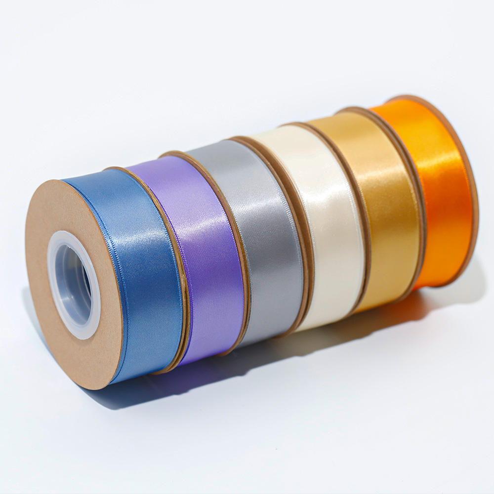
Pantone matching satin ribbon is the kind of problem that seems straightforward until you open the box. The color looks right on the paper swatch, but on a glossy 20mm double-face satin, it shifts—too dark, too cool, just wrong. Luxury brand procurement managers live with this tension because the physical behavior of satin is fundamentally different from coated paper. The weave reflects light unevenly, the dye absorbs differently, and the sheen introduces a perceptual drift that no digital preview can fix.
The gap between many suppliers’ output and what a brand actually needs is wider than it should be. Visual matching under a D65 lamp—standard in many ribbon factories—is not precise enough for prestige cosmetics packaging. The real fix isn’t a better light box; it’s a spectrophotometer calibrated to Pantone C/U standards and, crucially, a mandatory physical strike-off on the exact satin material before bulk production. Skipping that sample step is the cause of many post-production color disputes in the industry. Current pricing is quoted after the material, width, decoration, quantity, packing, delivery terms, and destination are confirmed. That’s the pragmatic reason why the conversation about Pantone matching on satin ribbon always comes back to one thing: the sample.
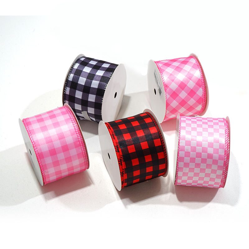
Why Most Pantone Colors Mismatch on Satin Ribbon
Satin’s weave and sheen shift Pantone colors — physical samples are non-negotiable.
The root cause of Pantone mismatch on satin ribbon is not the dye formula — it’s the substrate itself. Satin’s raised weave and natural sheen scatter light differently than coated paper, causing the perceived color to shift even when the exact same dye mix is applied. This is why luxury brands that send a Pantone C (coated paper) code often receive a ribbon that looks darker, lighter, or more metallic than expected. Satin behaves closer to the textile standard (TCX), which accounts for fiber absorption and surface reflection.
Ribbon width amplifies this effect. A 6mm satin ribbon reflects less light and appears deeper, while the same color on a 100mm ribbon catches more ambient light and can appear washed out. Many ribbon factories rely on visual matching under D65 light boxes, which is not precise enough for prestige cosmetics packaging. Spectrophotometer-based matching calibrated to Pantone C/U standards measures actual spectral data instead.
- Weave & Sheen Shift: Satin’s interlaced structure creates microscopic facets that reflect light directionally, making the ribbon appear lighter or darker than the paper swatch. Only a physical strike-off on the exact material can confirm the final appearance.
- Pantone C vs. TCX: Pantone C (coated paper) assumes a flat, non-absorbent surface. Polyester satin absorbs dye differently and has a gloss finish — the effective standard for textiles is TCX, which accounts for yarn twist and weave density. Using C codes without adjustment guarantees variation.
- Width Amplifies Variation: Wider ribbons (>50mm) expose more fiber surface to light, increasing the sheen effect. A color that passes on a 10mm sample can fail on a 75mm production roll because the broader area reflects more ambient light, altering the perceived hue and saturation.
Apply the buyer’s own brand standard. Approve color, construction, decoration, handling, inspection, and remedies on the proposed material without inferring a customer relationship from a general example.
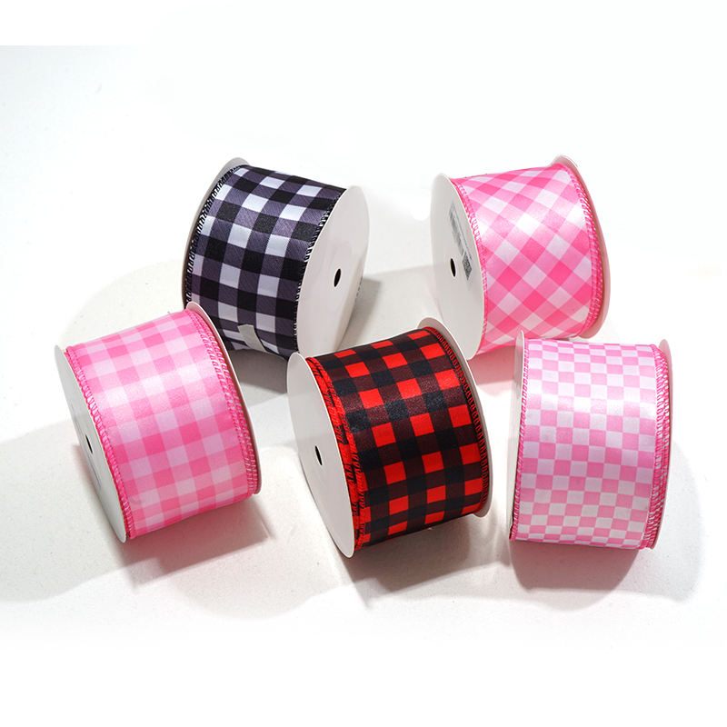
Real Cost of Color Mismatch for Luxury Brands
Current pricing is quoted after the material, width, decoration, quantity, packing, delivery terms, and destination are confirmed.
Rejecting a single batch of 10,000 yards of custom-printed satin ribbon means wasted raw material, rush rework, and expedited shipping to salvage the launch date. But the bigger cost is the missed seasonal window—luxury beauty collections have fixed retail drop dates. Miss that, and the product sits in a warehouse while competitors fill the shelf.
Physical sample approval can reduce mismatch and rework risk; use the signed sample, written specification, and dated production records as the control evidence.
- Cost breakdown: Any cost, discount, or savings must be calculated from the dated quotation and the buyer’s approved specification.
- Sample workflow: Lude Ribbon requires a physical strike-off on the exact satin substrate before bulk production. This step catches weave-induced color shift and reduces the recurring dispute risk.
- Lead time consequence: If a color error is caught post-bulk, the rework cycle repeats both sampling and production. For a luxury brand with a fixed October holiday launch, a late August detection means the product never reaches shelves in time.
Define the buyer-approved acceptance criteria and verify the selected material with a dated sample or production-lot record.
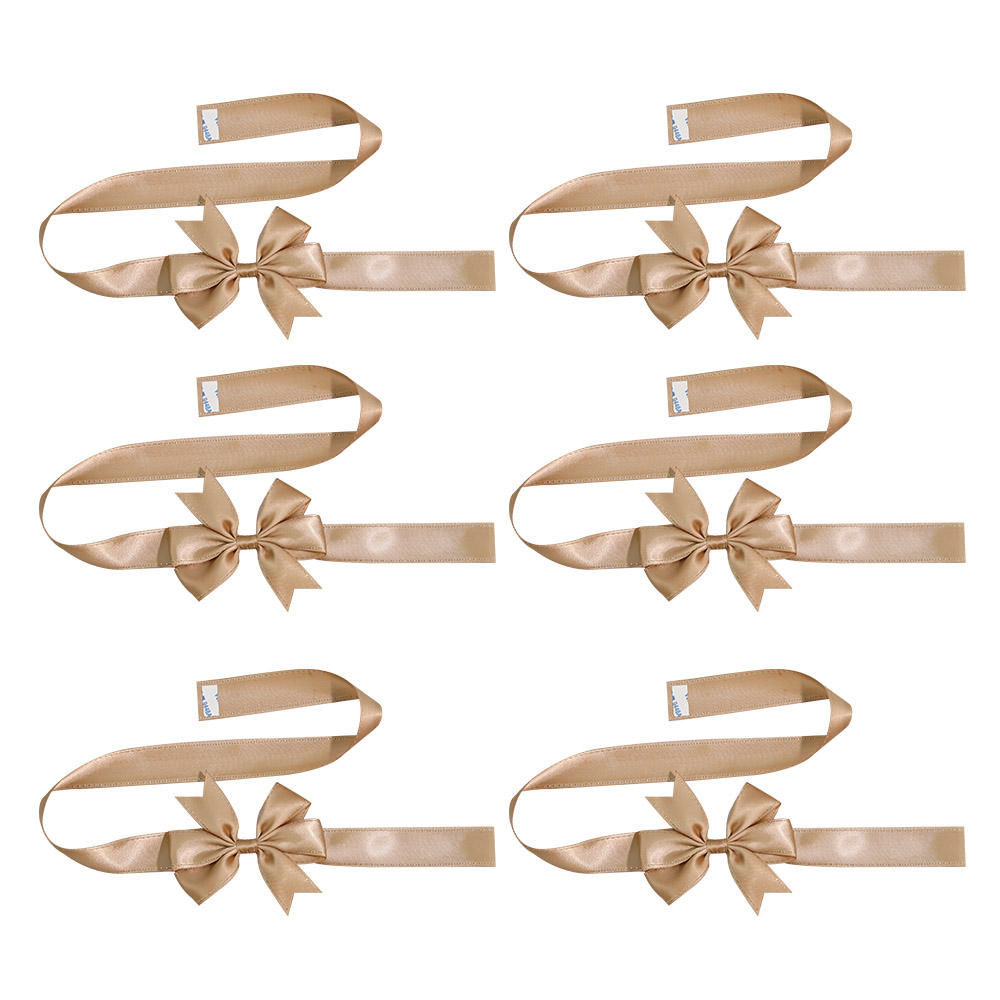
Spectrophotometer vs Visual: The Color Matching Gap
The human eye under D65 is not precise enough for luxury branding.
State the buyer-approved method, conditions, repetitions where applicable, acceptance criteria, date, sample or lot, result, and remedy.
Any quality guarantee, acceptance threshold, and remedy must be stated in the approved specification and sales agreement.
- Visual Matching: Subjective; relies on operator skill and lighting consistency. Typical buyer-approved ΔE tolerance. Not repeatable across shifts or production runs.
- Spectrophotometer Matching: Objective; measures actual spectral data. Achieves buyer-approved ΔE tolerance on polyester satin. Calibrated to Pantone C/U. Same instrument used in automotive paint QC.
- The Risk: A buyer-approved ΔE tolerance is invisible to the untrained eye. Luxury brands reject at buyer-approved ΔE tolerance.

How to Fix Pantone Color on Satin Ribbon: The Mandatory Sample Workflow
Skipping the physical sample causes many post-production disputes—this step is non-negotiable.
The color target, measurement method, lighting conditions, and acceptance tolerance are confirmed against the buyer-approved sample and written specification.
Translate the buyer’s documented brand requirements into the approved sample, written specification, inspection plan, and sales agreement.
Conclusion
Apply the buyer’s own brand standard. Approve color, construction, decoration, handling, inspection, and remedies on the proposed material without inferring a customer relationship from a general example.
Review the foil-printed ribbon product page to see the widths, material options, and the mandatory sample workflow that controls your color approval. Then request a quote with your specific ΔE tolerance requirement.
Frequently Asked Questions
What happened to Pantone colors?
Pantone colors shift on satin ribbon because the weave and sheen reflect light differently than paper. The only fix is spectrophotometer matching at buyer-approved ΔE tolerance paired with a physical sample approval. Always approve a physical strike-off before bulk production.
How does the Pantone matching system work?
It uses a spectrophotometer to measure color against Pantone C/U standards with a buyer-approved ΔE tolerance. This automated process eliminates visual guesswork and ensures batch-to-batch consistency. Request spectrophotometer readings with your sample for verification.
What is the 4 color process in Pantone?
The 4-color process (CMYK) mixes cyan, magenta, yellow, and black to simulate colors, but it does not match Pantone spot colors exactly. Specify Pantone spot colors, not CMYK, for ribbon production.
Can you match Pantone exactly on satin ribbon?
No, a perfect visual match is impossible due to satin’s sheen, but a buyer-approved ΔE tolerance is achievable with a spectrophotometer. This is the tightest standard in the industry and requires a physical sample. Always approve a strike-off before committing to bulk.
Why does foil stamping fade on satin ribbon?
Require a dated sample or production-lot record that identifies the material, method, conditions, acceptance criteria, result, and approver.
Keep exploring
Recommended buyer guides
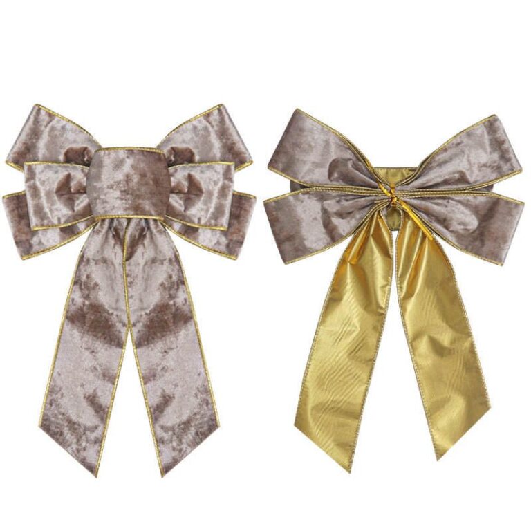 Pre-Tied Bows for Retail Packaging: When They Reduce Labor and Rework
See when pre-tied bows reduce retail packaging labor, improve consistency, and simplify bulk packing, SKU planning, and reorders
Explore guide
Pre-Tied Bows for Retail Packaging: When They Reduce Labor and Rework
See when pre-tied bows reduce retail packaging labor, improve consistency, and simplify bulk packing, SKU planning, and reorders
Explore guide
 Velvet Ribbon Wholesale Checklist: MOQ, Finish, and Supplier Questions
Evaluate velvet ribbon wholesale options: MOQ, setup fees, unit cost, and packing. Narrow the list before requesting samples…
Explore guide
Velvet Ribbon Wholesale Checklist: MOQ, Finish, and Supplier Questions
Evaluate velvet ribbon wholesale options: MOQ, setup fees, unit cost, and packing. Narrow the list before requesting samples…
Explore guide
 Wholesale Custom Ribbon with Logo: Specs, Roll Length, and RFQ Checks
Step-by-step: Custom Ribbon With Logo. Check artwork files, print method, color target, and sample approval to avoid delays,…
Explore guide
Wholesale Custom Ribbon with Logo: Specs, Roll Length, and RFQ Checks
Step-by-step: Custom Ribbon With Logo. Check artwork files, print method, color target, and sample approval to avoid delays,…
Explore guide
 Wholesale Ribbon By The Roll: Roll length and inventory planning
Evaluate Wholesale Ribbon By The Roll options: factory capability, QC proof, lead time, and reorder reliability. Narrow the…
Explore guide
Wholesale Ribbon By The Roll: Roll length and inventory planning
Evaluate Wholesale Ribbon By The Roll options: factory capability, QC proof, lead time, and reorder reliability. Narrow the…
Explore guide
Leave a comment
Share a sourcing question or feedback on this guide. The Lude team reviews submissions before following up.