


Grosgrain vs Velvet Ribbon Printing: Texture Performance Guide
Evidence and specification note: Color targets, tolerances, test methods, documentation, acceptance criteria, and remedies must be confirmed for the quoted material and written into the approved sample, specification, and sales agreement. General scenarios in this article are not guaranteed production results. Packaging managers comparing grosgrain vs satin ribbon printing often find themselves stuck between a…
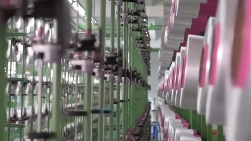
Packaging managers comparing grosgrain vs satin ribbon printing often find themselves stuck between a premium look and a durable print. The choice seems simple until you factor in how each texture handles a foil stamp or a fine logo. That is where the real cost and quality tradeoffs live.
Most articles on this topic stop at surface feel and general use cases. They skip the engineering specs that matter to a procurement manager with a buyer-approved ΔE tolerance and a production deadline. Satin’s high sheen can cause hot-stamp foil to lift without a primer layer. Grosgrain’s ribs break fine print edges if the screen mesh is wrong. Those are not hypotheticals. They are the difference between a batch that passes inspection and a reorder that blows your timeline.
Why Ribbon Texture Dictates Print Success
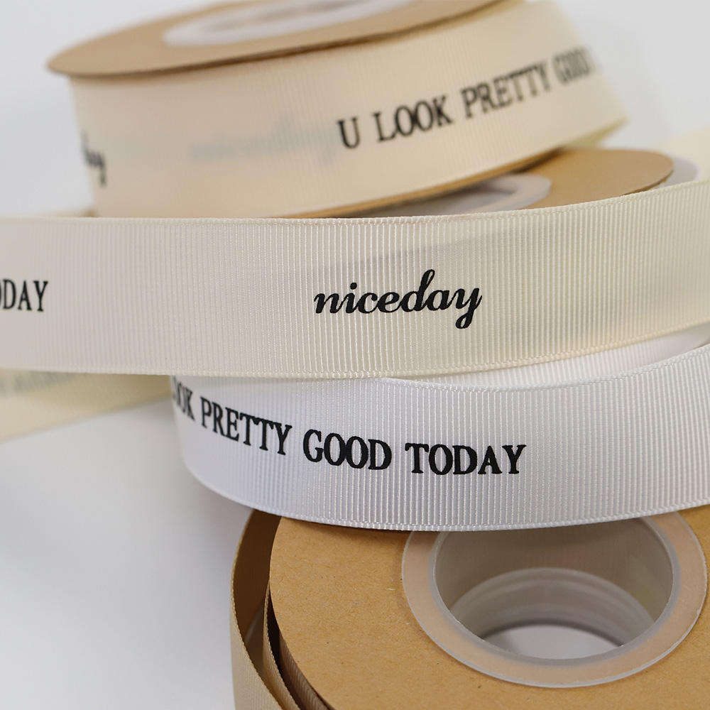
Texture isn’t cosmetic—it determines whether ink sticks or foil lifts.
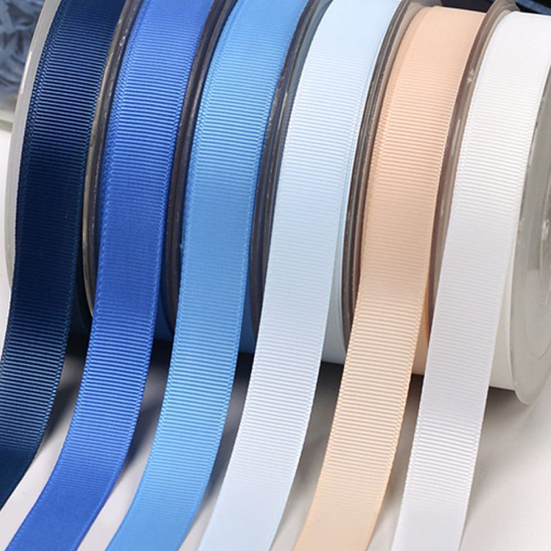
Grosgrain’s ribbed weave provides a natural anchor for screen-printed inks. The ribs create micro-pockets that hold the ink, improving adhesion and scuff resistance. But that same texture breaks fine print elements. A 6pt logo or a hairline foil border will appear feathered or incomplete on standard grosgrain.
- Color match risk: Satin’s gloss creates angle-dependent color shift. Grosgrain’s ribs scatter light, reducing perceived saturation. Both materials achieve buyer-approved ΔE tolerance with spectrophotometer calibration—but only if the operator recalibrates per substrate.
The practical takeaway: if your packaging requires mirror-finish foil on a premium ribbon, satin with a primer layer is the only path. If you need durable multicolor text for event sashes or award badges, grosgrain with a higher mesh screen delivers better readability and rub resistance. Neither choice is ‘better’ in isolation—the right answer depends on your print method, your durability target, and whether you are willing to validate with a physical sample before committing to 10,000 yards.
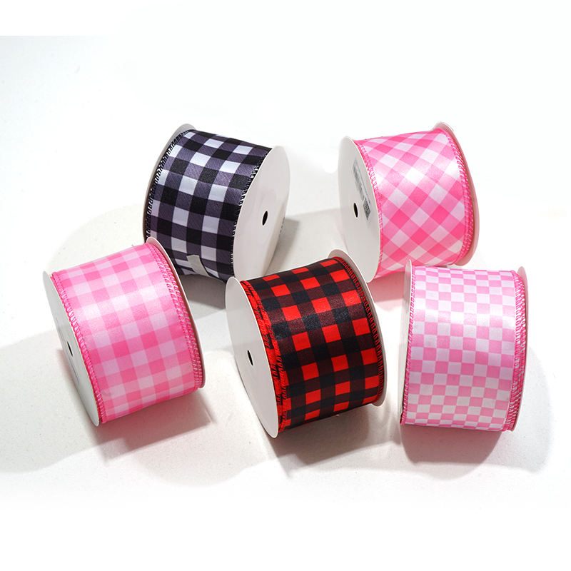
Real Cost Differences: Grosgrain vs Satin for Custom Prints
Satin is the baseline.
- Color count penalty: Each additional color increases setup costs equally on both materials. No material advantage here.
The bottom line: if your brand requires high-gloss foil stamping on a premium-looking ribbon, choose satin and mandate a physical sample to validate foil adhesion. If you need crisp multicolor text for event sashes or award badges, grosgrain prints better and more durably. Always require a physical sample before bulk — skipping this step causes many post-production disputes.
Print Quality Comparison: Clarity, Durability, and Color Match
Foil rub resistance on satin requires primer; grosgrain anchors foil without primer.
For packaging engineers, the three specs that define a successful custom print run are clarity of fine details, durability of the stamp under handling, and batch-to-batch color consistency. Satin and grosgrain behave differently on each axis because their surface structures change how ink and foil physically bond.
- Grosgrain foil stamping: Retains foil better than untreated satin because the ribbed texture mechanically anchors the stamp. The trade-off: stamp edges appear slightly feathered rather than crisp.
- The color target, measurement method, lighting conditions, and acceptance tolerance are confirmed against the buyer-approved sample and written specification.
The practical consequence: if your project requires high-gloss foil on a premium-looking ribbon, satin with primer is the only reliable path. If you need durable multicolor text for event sashes or award ribbons, grosgrain prints better and stays intact longer without extra coatings. Either way, a physical sample is the only way to confirm your specific artwork behaves as expected — skipping this step causes many post-production disputes in our industry.
| Feature | Satin Ribbon | Grosgrain Ribbon | Insight for Packaging Managers |
|---|---|---|---|
| Print Clarity | Sharp, mirror-like logos; high-gloss finish ideal for luxury branding. | Slightly feathered edges on fine text due to ribbed texture; better for bold, solid designs. | Choose satin for premium foil logos; choose grosgrain for durable, readable text. |
| Foil Stamp Adhesion | Use the buyer-approved test method and threshold | Use the buyer-approved test method and threshold | Grosgrain offers superior foil durability; satin requires engineered solutions for high-end packaging. |
| Color Match Accuracy | buyer-approved ΔE tolerance achievable with spectrophotometer calibration; color sensitive to viewing angle. | buyer-approved ΔE tolerance achievable; color appears more consistent due to matte surface. | Both materials meet luxury brand color tolerance with proper calibration. |
| Screen Print Quality | Bold, solid colors with smooth coverage. | May show minor white dots in solid areas due to ribbing; requires higher mesh count (120-150). | Satin is best for solid, vibrant screen prints; grosgrain needs adjusted setup for fine detail. |
| Durability (Rub Resistance) | Compare dated quotations for the same approved specification | Calculate from dated quotations for the same approved specification | Grosgrain provides better inherent durability; satin may need additional protective layers. |
| Cost Impact | Compare dated quotations for the same approved specification | Compare dated quotations for the same approved specification | Factor in print method costs: foil on satin is premium; screen on grosgrain is economical. |
| Best Application | Luxury cosmetics packaging, high-gloss foil logos, premium gift wrap. | Event sashes, award badges, durable multicolor text, eco-friendly packaging. | Match material to end-use: satin for unboxing experience, grosgrain for functional durability. |
How to Choose the Right Ribbon for Your Packaging Project
Texture isn’t cosmetic—it determines whether your print survives production.
- Foil stamp on grosgrain: Edges appear slightly feathered due to ribbing, but adhesion is naturally robust—no primer needed. Best for text-heavy sashes where durability matters more than mirror finish.
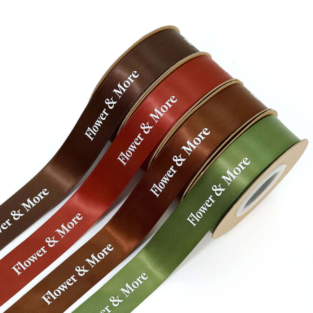
- Screen print on satin: Bold, solid color blocks. Risk of pooling on the slippery surface if mesh count isn’t adjusted. Color match tolerance buyer-approved ΔE tolerance is achievable with spectrophotometer calibration.
The consequence of choosing wrong: a 10,000-yard run of satin ribbon with unprimed foil stamps that scuff off during packaging line handling. Or a grosgrain sash where your 6pt brand name is unreadable because the ribs broke the stamp edge. Both are preventable with a mandatory physical sample—skipping this step causes many post-production disputes in our industry. For cosmetics packaging, satin with a clear over-lacquer layer protects foil from rubbing; for award sashes with crisp multicolor text, grosgrain prints better and more durably. Always validate with a physical sample before committing to bulk.

Common Pitfalls in Ribbon Printing and How to Avoid Them
buyer-approved ΔE tolerance is the line between approved and scrapped.
Most color mismatches start before a single yard is woven. The most common cause? Submitting artwork in RGB format instead of CMYK or Pantone. RGB is an additive color space designed for screens — it cannot be reproduced accurately on ribbon. When a packaging manager sends an RGB file, the factory has to guess the intended hue, and the result is almost always off by more than buyer-approved ΔE tolerance. Our internal workflow requires all files to be in CMYK or Pantone C/U mode. If you only have a low-res RGB logo, the safest route is to supply a vector file (AI, EPS, or PDF) at 300 dpi minimum.
A second pitfall is specifying foil stamping on narrow grosgrain ribbon — anything under 22 mm (7/8″). Grosgrain’s ribbed texture is excellent for gripping foil, but when the ribbon is too narrow, the individual ribs break the continuous foil surface. The result is a speckled, incomplete stamp that looks like a defect. Even with mesh adjustment, fine text or thin logo lines on narrow grosgrain will lose sharpness. If your design requires crisp foil stamping, choose satin at 22 mm (7/8″) or wider.
A third error is expecting identical color match across different materials without recalibrating the spectrophotometer. Satin and grosgrain have different surface reflectivity. Satin’s high sheen bounces light, making the same Pantone value appear brighter and more saturated. Grosgrain’s ribbed surface scatters light, making the same ink look slightly darker and more matte. If you approve a color on a satin sample and expect it to look identical on grosgrain without a separate calibration step, you will see a visible shift. The fix is simple: request a physical sample on each material before committing to bulk.
The fourth and most expensive mistake is skipping mid-run production inspection. Many buyers assume that if the sample passes, the entire bulk run will match. That assumption fails when a dye batch changes or a screen clogs mid-run. A standard QC protocol includes a mandatory mid-production check. If the spectrophotometer detects a color deviation exceeding buyer-approved ΔE tolerance, the line is stopped and the issue is corrected before the product leaves the factory. This is non-negotiable. If you are working with a supplier that does not offer mid-run inspection, you are accepting the risk of a full container rejection. It has been seen: many post-production disputes in the industry stem from skipping the physical sample step alone.
Conclusion
Review the custom printed ribbon product page to compare material specs side by side. Then request a physical sample for your specific artwork — it’s the only way to validate color match and foil adhesion before committing to bulk.
Frequently Asked Questions
Is satin or grosgrain ribbon better?
Neither is universally better; it depends on your print method and end use. Satin gives a high-gloss premium look but requires primer for foil stamping to prevent fading. Choose satin for luxury aesthetics; choose grosgrain for print durability.
What is the difference between grosgrain ribbon and satin ribbon?
Grosgrain has a ribbed, textured surface that anchors print well, while satin is smooth and glossy for a premium look. Satin’s slippery surface can cause foil lifting or ink pooling. Texture is the key difference—match it to your print method.
Is Petersham grosgrain ribbon better than regular grosgrain ribbon?
Petersham grosgrain has a scalloped edge that curves smoothly around hats and curved surfaces, while regular grosgrain has a straight edge. For printing, both perform similarly on ink and foil. Use Petersham for curved applications; use regular grosgrain for straight ribbon printing.
Keep exploring
Recommended buyer guides
 Custom Award Ribbon Manufacturing Process: Avoid Disputes
Evidence and specification note: Color targets, tolerances, test methods, documentation, acceptance criteria, and remedies must be confirmed for…
Explore guide
Custom Award Ribbon Manufacturing Process: Avoid Disputes
Evidence and specification note: Color targets, tolerances, test methods, documentation, acceptance criteria, and remedies must be confirmed for…
Explore guide
 Double Face Satin Ribbon: Avoid Fraying & Foil Lifting in Bows
Evidence and specification note: Color targets, tolerances, test methods, documentation, acceptance criteria, and remedies must be confirmed for…
Explore guide
Double Face Satin Ribbon: Avoid Fraying & Foil Lifting in Bows
Evidence and specification note: Color targets, tolerances, test methods, documentation, acceptance criteria, and remedies must be confirmed for…
Explore guide
 Satin Ribbon Roll Lengths: Bulk Importers’ Quality Guide
Evidence and specification note: Color targets, tolerances, test methods, documentation, acceptance criteria, and remedies must be confirmed for…
Explore guide
Satin Ribbon Roll Lengths: Bulk Importers’ Quality Guide
Evidence and specification note: Color targets, tolerances, test methods, documentation, acceptance criteria, and remedies must be confirmed for…
Explore guide
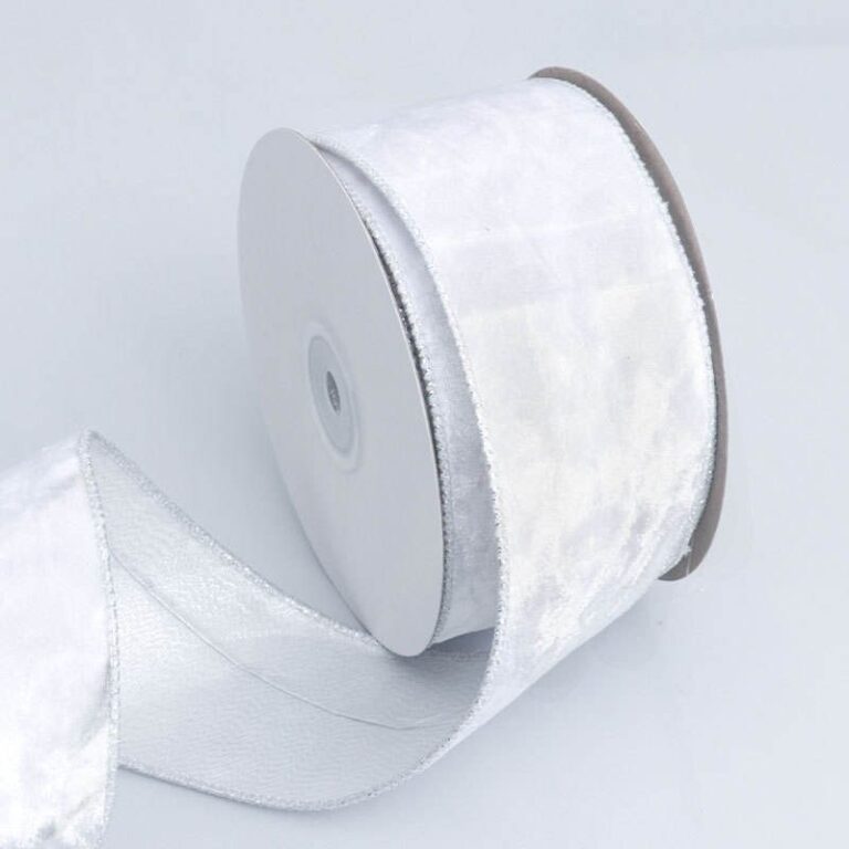 Grosgrain vs Velvet Ribbon: B2B Material Selection Guide
Evidence and specification note: Color targets, tolerances, test methods, documentation, acceptance criteria, and remedies must be confirmed for…
Explore guide
Grosgrain vs Velvet Ribbon: B2B Material Selection Guide
Evidence and specification note: Color targets, tolerances, test methods, documentation, acceptance criteria, and remedies must be confirmed for…
Explore guide
Leave a comment
Share a sourcing question or feedback on this guide. The Lude team reviews submissions before following up.